Logo of the City of Haarlem
2023
City of Haarlem

Digitizing application for social assistance

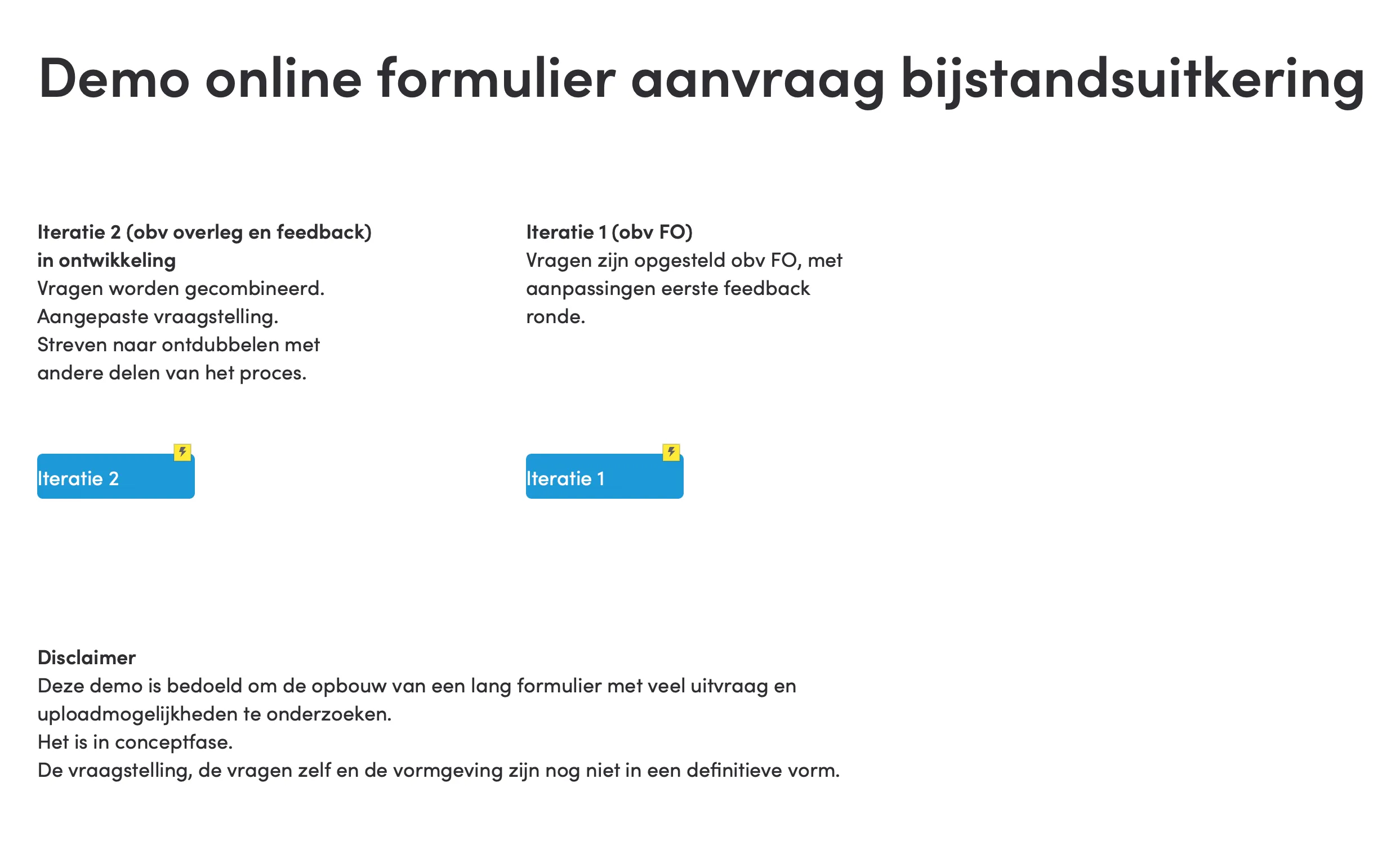
The City of Haarlem started a project to digitize all their online forms. One of these forms is the application form for social assistance. Social assistance is financial help from the municipality for people who don't have enough money to live on.
The project team working on it, asked me to think along about how the paper version of the application could be converted to a digital version. Our goal? To simplify and speed up the process, both for citizens and civil servants. To reduce the number of errors and receive the correct data faster. So that the applicant does not have to wait unnecessarily long for the assessment of their application.

Continue reading...

My role

As the UX Designer on this project, I guided the redesign of the transition from a paper to a digital application form for social assistance. My tasks included running user research, re-designing form questions to increase usability, and engaging various teams and stakeholders.
Prototyping
User research
UX Process
Accessibility

Responsibilities

In this project, I worked closely with the project leader digitalization, the team work and income, the web editorial team and the internal software house to come up with a design that matched the digital environment of the City of Haarlem in terms of content, technology and communication. During the process, I iteratively worked on a prototype that served as the basis for further development.

Timeline

2023-24

Team

The municipality's project core team, Haarlem project leader digitalization, development and various external stakeholders.
Screenshot of the prototype showing the overview of data.

Understanding the problem and getting citizens involved

I first want to understand what the problem is that needs to be solved and what user groups are involved. What is their motivation? And what are they potentially running into?
In this project - with limited time - we used "proto-personas" with the team to empathize and ask stakeholders the right questions about the process and product. Based on several sketchy ideas, I built a prototype on paper and later in software.
Ultimately, the prototype was taken from mid- to hi-fidelity by the art director and with input from the content provider and served as the basis for further development by the development team.

Illustration of the Double Diamond process.
Stap 1
Discover
The request for the redesign came to me at a time when an initial functional design had been delivered, based on the paper form.Together with the team, we identified user needs and issues, through research, and got a clear picture of the user group and the current process. We gathered useful insights and common bottlenecks from previous projects and their experiences with citizens. We received additional input and suggestions for improvements from the Participation Council and experts by experience. We also drew on knowledge of best practices from both home and abroad.A major concern turned out to be the length and complexity of the form and the short period of time in which users would have to fill in data without being logged out, as described here in a column by a resident from Haarlem.
Lief and I have been together for 21 years and are going to convert our cohabitation contract into a registered partnership. Via the site of the municipality of Haarlem, we can arrange the request for this online. We should keep copies of our passports and those of our witnesses ready, we read. Once we have collected it, we snuggle up on the couch side by side to fill out our “partnership file” online. That does not go entirely without a hitch. Seven pages must be completed. On page 4, things go wrong. We are trying to upload photos of our witnesses' passports where the system is refusing further service. We log in again in good spirits. Oh, that's a shame... Everything we filled in on pages 1 to 3 is gone. No problem, let's just do it again. Once again, things go wrong when uploading. New attempt. Failed again. Getver, would a popup screen be blocked sometimes? No, that's set up well. Again! Error message. Slightly grumpy, we give up. The next day, instead of the iPad, we grab the laptop. Once again, everything we were able to fill in earlier appears to be gone. Sigh... The advantage is that I now have all my parents' baptismal names firmly in my head. Pages 1 through 3 are completed in no time. Hoppa, page 4, let's go. So not. Again, refuse to upload the files. Again, just to be on the safe side via a different browser, maybe that's the problem? That doesn't work either, we're getting really annoyed right now. After the eighth attempt, we give up. Would this be a kind of covert relationship test by the municipality? See if we don't beat each other's brains? Finally, we make an appointment to fill in the necessary information in person at the Municipal Office a few days later. Ten minutes later, we are outside again... The details have been filled in, the copies of the IDs handed in. Passed the relationship test!
Column from Haarlems Dagblad that captures quite accurate what many customers experience when filling out online forms: too long and not enough time.
Step 2
Define
The collected information and ideas from the discovery phase refined and concretized into sketches and proposals. Together with the team, we identified the most important insights about users and processes and prioritized the most important adjustments to the first functional design.
A spreadsheet with the definition of all fields in the form. Difficult for an outsider to grasp and impossible to test with civilians.
Part of the original process definition, shown in a spreadsheet.
Step 3
Develop
In this phase, I developed various solution directions by means of sketches, user flows, wireframes, and mid-fidelity prototypes. These concepts were tested with users and assessed with stakeholders to make an informed choice for the final design.

Flows

I created an extensive step-by-step plan in a tool like Typeform to provide insight into how questions initially followed each other. Is the dialogue correct?

Sketches

Dividing the form into chapters, interim storage and a clear way to report household members, for example. Outlined for later elaboration.

Sketch of a flow explaining the concept of dividing a large form into smaller parts.
Part of a flow created in Typeform to get an idea of the possible complexity.
Screen with a number of buttons where a prototype can be started.
Step 4
Deliver
In the final phase of the design process, I combined the ideas. This makes it tangible for the rest of the team, but also for the end user. We used the feedback to further refine and improve the design.

Prototype

I did the prototyping with a GOV.UK web kit on the one hand, but ultimately with a tool that allows rich interactions, allows input and can follow conditional paths. Hence Axure RP. Not a new tool, but valuable in these cases.

Testen

We presented a hi-fidelity prototype in several rounds to citizens who could relate to the situation of the target group or belong to the target group. The results were shared with the team and led to further adjustments.

Result of notes taken during one of the sessions. Written on a whiteboard.
Example of a dialogue where users are given the opportunity to continue later and save the input in the meantime.

Ready to discuss your next project?

Interested in collaborating or having a good conversation?

Let's have chat!

+31 62 63 34567

send me an email

LinkedIn-profile
made with proud in Purmerend